Tuesday, November 13, 2012

The Moebius Loop

So I began working on Johnny Morte maybe two years ago?  It has taken this long to get it just the way I want it, and the story has evolved over the period and the look of it has changed.  Visually, it hasn't changed a great deal, but the story is a lot better, I think.  It is a comic, and I do view it as a 'pop project' to fund the other stuff, but it isn't a throwaway project, and I hope the length of time it has taken me to finalise the script and the artwork illustrates that.  I do take it seriously, and I won't let it go until I know it's the best I can do.

Letting it go is the problem really.  For decades now I have had a problem letting things go.  In fact, on several occasions I have supplied magazine publishers and card companies with "second drawings" along with the finished approved work.  This "second drawing" is a "really finished" drawing that I think is an improvement on the one requested.  At no stage, has any publisher used the "second drawing".  But quite recently, I took this obsession with getting things just right, to a whole new level.  I was looking at some old artwork I did in the 1980s, which was in a comic so it's a matter of record somewhere - it's an historical fact in some dusty collection somewhere, and I was going to put it online, and I actually found myself thinking about redrawing it.

Can you believe that?  I mean to say, in what way would that have been authentic?  I was going to post a thirty year old drawing that I drew yesterday. It wasn't as if I was going to re-imagine it, or contemporise it, or make it the way I always imagined it would be - all much more valid reasons for doing it.  No, what I wanted to do was remove the "mistakes" I made back then.  I knew right there and then that I had a problem, and knew what the problem was; I hate anything by me.  I was in danger of being caught up in a moebius loop where I would spend the rest of my life redrawing everything I've ever done every what?  Every 6 months, every year, every decade?  It suddenly became apparent to me that I have been doing this for some time.  Now, a version of this behaviour does have its place in the work I do. In cartooning one often looks back over the old rejects and even the accepted cartoons for new ideas, for a new spin, but that's different, that's re-interrupting the work, making it more contemporary.  What can't be healthy, surely, is being stuck in the frame of mind where one endlessly redraws the same exact idea over and over again, in a futile search for perfection - especially when that time would be better spent moving on and coming up with new ideas.

So here we go.  I'm on page 9 of JM Comic book #1 and very soon I'll have the entire 26 or so pages finished.and it'll wing its way away and it will be "the best I could do at the time" and that is what it will remain.  It's very freeing to set aside a compulsion, it's like stepping outside a moebius strip.


Right click to open in a new window. Clicking on through throws up tiny graphics.

Monday, October 22, 2012

A Very Happy Lovecraftian Halloween

American author, Howard Phillips Lovecraft's (August 20, 1890 – March 15, 1937) stories and his literary philosophy of "cosmicism" , the belief that life is incomprehensible to human minds and the universe is fundamentally hostile to the interests of humankind, exert a tremendous influence on modern fiction, and have had, and continue to have, a profound impact on the world of comicbooks.  It is an influence that began during the author's lifetime.  In his essay, "H. P. Lovecraft and the Cthulhu Mythos", Robert M. Price identifies the "Cthulhu Mythos proper", a sharing of Lovecraftian-lore by Lovecraft's contemporaries, formulated during his lifetime, and subject to his guidance. The second stage identified by Price, is the stage guided by the person who coined the term the Cthulhu Mythos , August Derleth, who published Lovecraft's stories after his death, and attempted to catalouge and expand the Lovecraftian Mythos.  The second stage, the expansion of the Cthulu Mythos after Lovecraft's death, in stories, films, and comicbooks, has been so successful that librarians and booksellers still have to turn away would-be occultists who search in vain for the Necronomicon, Lovecraft's fictional grimoire of magical rites and forbidden lore.  The Necronomicon, as a shared element in fiction has surfaced in both the Cthulu Mythos Proper, and the later Cthulu Mythos.  In his short story, "The Children of the Night" (1931), Conan the Barbarian author, Robert E. Howard (a member of the "Lovecraft Circle" along with Clark Ashton Smith, the author of Psycho, Robert Bloch, Frank Belknap Long, Henry Kuttner, and Fritz Lieber), had his character Friedrich Von Junzt read Lovecraft's Necronomicon.  In his four-issue comicbook series Neonomicon, writer Alan Moore both expanded and subverted the Cthulu Mythos, by foregrounding, naming, and showing, graphically, the unameable terrors that lurk in the deep structure beneath the surface of Lovecraft's Mythos.  Lovecraft's Arkham Sanatorium found its way into the DC universe in the 1970s courtesy of Dennis O'Neil and during its time it has housed The Joker, the Riddler, Bane, and others and has featured in Alan Moore's Swamp Thing, Neil Gaiman's Sandman, and in a number of DC's mini-series.
 
The magazine Metal Hurlant, was created by "Les Humanoïdes Associés" ( Jean Giraud (Mœbius), Philippe Druillet, Jean-Pierre Dionnet and Bernard Farkas) in 1974.  During its hugely influential run, which ended in 1987, it featured work by, amongst others, Jean-Claude Forest (Barbarella),  Richard Corben, Alejandro Jodorowsky, Enki Bilal (Immortal), Caza, Serge Clerc, Alain Voss, Berni Wrightson, Milo Manara, Frank Margerin, Angus McKie, and many others.  The Lovecraft edition in the US, where it was published as Heavy Metal, features a beautiful cover of Mister Lovecraft, by the fabulous J.K. Potter, which was markedly different to the equally beautiful H.R. Giger cover that graced the French edition.  All art is copyright the respective copyright holders.


Let me just warn you in advance that I've left some stuff out and avoided scanning entire stories in order to make sure we don't inadvertently put anyone's hard work into the public domain.  What is left, I hope, gives you a feel of the collection.  I haven't randomly omitted things, but I have chosen the stuff I think works very well, either as faithful adaptations of Lovecraft's work or in expanding the Cthulu Mythos.  One of my favourite's is the first story, Final Justice, by Chateau.  The artwork reminds a little of some Weird Stories and even some Sandman episodes.  Whilst I like most of the stories, attempts at expanding the Lovecraft Mythos, like  KTULU by Moebius, could have done with a little more thought, I think.  I love the look of  Xeno meets Dr. Fear and is Consumed, by Terance Lindall and Chris Adames, The Man from Blackhole by Clerc, Dewsbury's Masterpiece by Charland and Cornillion and Druillet's Excerpts from the Necronomicon.  I could have done with a little more Randolph Carter and the Cats of Ulthar in The Language of Cats by Claveloux, but it is what it is and it all goes to show that whether you adapt Lovecraft faithfully or just drop a little Lovecraftian Mythos into your text or a little sodden Lovecraftian love into your drawings, you end up with an interesting outcome.


I have quite a bit of Breccia's Lovecraft work here at McKie Towers.  It is all very beautiful to look at.  If I had to imagine a perfect artist for Lovecraft's The Dunwich Horror, or any Lovecraft story it would be him.


Friday, May 04, 2012

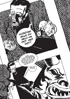
Wonderful Copenhagen, Allan Haverholm's Sort-Mund

I was obsessed with comicbooks when I was a schoolboy, American comicbooks.  During some lessons I sat daydreaming, especially when the lesson involved the teacher talking about her time in Dar es Salaam - which she did a lot. I tried to imagine what comicbooks they had there, and then I was off, staring over at the globe in the corner of the room and imagining what comicboks were like in India, in Holland, in Italy, in Denmark.

It's still a real treat for me to get my grubby little mitts on these treasures, and I love seeing them in their native language, rather than in English translation. That's why I was delighted when Allan Haverholm let me have a copy of his graphic novel, Sort-Mund, and had no problems with the fact that I cannot understand a word of Danish. I spoke with Allan about blogging on Sort-Mund, and making a stab at what is going on in it, using only the drawings to feel my way through the story, and he decided it would be an interesting experiment.  Besides, I figured that even if I was way off target with the story, I would still be able to share Allan's wonderful drawings with you.


A good place to start when you're reading a book is the title.  A lot of thought goes into titles. Somewhere in the house here I have a copy of the sheet of paper Dickens used when he was struggling to name Hard Times; he went through a lot of ideas before settling on that title. But I wanted to avoid looking at Babelfish and decided that Sort-Mund was a place.  It's not, I now know, Sort-Mund means Black Mouth, but I've avoided trying to translate chunks of dialogue because whether I've understood the text or not, I've been able to fashion some sort of story, in my head,
from Allan's drawings.


I love the opening page, our entry into the story, i's a stark, noirish, Dr Caligari-type cityscape, with Triffid-like tentacles breaking through the surface and blocking the path of a loan figure. He turns and races back the way, through a park, and then it becomes clear that the protagonist has been dreaming.  The scene then switches to a domestic setting, but there are one or two visual clues that this sunny morning may retain something of the strangeness of last night's dream.  The shadow of the window frame on his face forms the shape of the cross, outside his charming cottage, there's a black crow watching him collect his mail, the whistling kettle, the first real sound we hear screams across the page.  We're pretty confident something is going to happen and there's a hint or two that it might involve religion of some sort, death, and maybe even something Lovecraftian.        


The letter causing our protagonist, Manne Svarts, to go collect something from a counter or teller or collection point 665 (almost 666 and just one of the numerical and symbolic hints and clues laced through the text), and there may again be an interruption from a dream or from an imagined war-time scene. This worrying thread, that suggests a fracture of some sort in our hero's thinking or even in his mind, continues as we move from the protagonist's reality of modern-day Denmark, of coffee houses and bus trips, back into his violent dream scape where he dreams within the dream and morphs into the violent perpetrator.  It's becoming clear that reality and fantasy are becoming problematic for our hero.


There are really nice shifts in POV as Allan introduces different characters, like the trendy young researchers, into the story, and the noir mood lights even the most cozy, domestic, scenes, warning us that there is a dark shadow hovering over the text.  That dark shadow belongs to Satan, and the introduction of a diabolical book is very well handled by the artist, with a nice change of lettering to establish the text of the book as separate from the text of the story itself and the angular drawing establish the book's illustrations as different from the reality-based illustrations of the story. The pace moves on and the story carries us into some exciting visual areas as a modern computer-driven reality, and a dream scape melded to chessboard, swirl around the pages and remind us of the famous scene in that old movie where the Gods summon the Titans and play chess with human lives.


It soon becomes clear that the violent dreams have some basis in reality, and that people in Copenhagen are being killed.  And our protagonist's vivid nightmares, his day dreams, and the voices he is hearing in his head, have to lead us to wonder if he maybe isn't actually polishing people off himself.  But he is just one of the suspects in this tale that jumps time zones and hints at macabre doings and arcane knowledge, and I'm now suddenly conscious that I might accidentally stumble onto the truth of the story and produce spoilers, so I'm going to stop now. 


I think Allan has produced a pretty impressive graphic novel with Sort-Mund, and I wish I'd got it years ago when it was first published.  The sheer amount of experimentation with lighting, with the lettering, with the panel structure, puts me in mind of the sort of experiments that Joyce dabbled with in Ulysses. In many ways, Allan has made some very bold decisions in Sort Mund, and it's a book that should be studied by other graphic novelists because it has some pretty fancy pen work and some great ideas.


Saturday, April 28, 2012

Picking Over Eric Orchard's MarrowBones


I like Eric Orchard. I like Eric's work too, he has a lightness of touch, and can invoke a genuine sense of creepiness that is almost in the same league as the feeling of Unheimliche that Renee French captures with her drawings. But his talent doesn't end there, dammit, he can also write well, as his latest comicbook, MarrowBones, clearly shows.


It's a difficult thing to do, introducing your imagined world to the reader for the first time; in any medium. But I think it is especially difficult in a graphic story, as it often requires a degree of verbosity that limits the area that can be used to illustrate exactly what is going on.  In a Gothic poem or story, the scene can be set quickly, and effectively, and economically, with very little need for the reader to do any work: "Once upon a midnight dreary..." immediately sets the scene for the reader, and the rhythm and cadence drives Drearily Down as the mood is hammered home. Within seconds we are partners in the bleakness.  In a comicbook the dreariness has to be illustrated, literally, and you can't cheat, you can't just draw a darkened sky and have one character blurt out "what a dreary place".  Well you can, I suppose, but the reader will see through that approach soon enough.  The reason Eric Orchard succeeds in quickly imparting information about the world the reader of MarrowBones will inhabit, quickly, is because all the visual clues are there from the very first moment the reader interacts with the book.  Everything, from the fetid, dripping, Marrowbones logo, with its cleverly incorporated skull, to the cover design, to the muted palette, and the choice of  lettering, all works toward one end, establishing the Gothic tone that is both uncomfortably strange and because of our experience of other Gothic tales, uncomfortably familiar.  It is, a fully imagines world and we have every reason to believe the author when he claims that the project has been gestating for some time.


The cleverness of the tale is in using a crypt-keeper-type of character as a narrator. This is a nod to comicbook history, as it invokes memories of the old 1950s EC comic Tales from the Crypt, and many a horror comic and TV series and movie since, and it is also an extremely effective way of establishing the history of the imagined universe as economically as possible.


MarrowBones also succeeds in bridging the gap between a cute vampire tale like Hipira, by Katsuhiro Otomo and Shinji Kimura, and the outright horror of Junji Ito's vision.  Somewhere between both these extremes, lies Marrowbones and it is a very welcome addition indeed.   


MarrowBones Issue One can be downloaded for around $2 from Eric Orchard's blog at http://ericorchard.blogspot.co.uk/ .