There's a place, somewhere in between being fully awake, and being asleep and dreaming, where the creative mind roams in search of ideas. It's an inner-space, like a vast landscape in some computer game, which seems to be timeless, or at least seems to exist outside time. Sometimes, when you are in that lonely inner space, if you're lucky, ideas come, and problems that seemed insoluble in the harsh light of day, are solved. There are areas of this creative landscape though, that are inaccessible to all but the very brave and/or the very dedicated. These are the dark corners of the creative landscape. They are nooks and crannies over there in the dark woods, up there high on the mountain tops or buried deep, deep, down in the undergrowth. They lie behind the many signs along the forking-paths of the creative landscape that say 'This Way Madness Lies'. Most of us avoid looking for ideas in those areas, because the risks may be too great. But some brave souls go into those places on our behalf, and they bring back the stories they find there. To my mind, Kate Bush is one of those very daring adventurers, who go into those dark corners to shine a light on what they discover there.

So, I doubt it will come as a huge surprise to you to discover that I made my way down to London, last month, to catch Kate Bush's show, Before the Dawn (I was so tempted to leave the typo 'Down' as a tribute to the dodgy poster being sold outside the Apollo :) Thanks, Zee and Caleb). A feat only made possible by the Herculean perseverance, and the Hachidan keyboard skills of the fabulously talented artist, Kenris McLeod, who never gave up, and eventually tapped the Eventim ticket-ordering page into submission.
I haven't attempted to write anything about the event before now, for two reasons, firstly, because if I had written something immediately after the show, it would have reflected all I could really think and say at the time, and that really didn't go far beyond "bloody hell" and "wow". I might have scrawled it all over the page though, so it was a bloody big "Wow", even a huge "Wow", but the response would still have been limited to that monosyllabic utterance. And secondly, because many of my friends in the Fish People Kate Bush Fan Group had not yet been to see the show, and I didn't want to spoil the surprises that lay ahead of them.
Of course, I’m now in a similar position with those of you who weren't lucky enough to score tickets for the show, and are eagerly awaiting the Kate Bush, Live: Before the Dawn DVD, so I've tried to balance telling you something about the show, without ruining the very big surprises. It’s a difficult balance, so please excuse me if I get a little over-excited and overstep those self-imposed boundaries. I'll do my best to be careful, and hopefully, I will succeed a little in whetting your appetite, without completely spoiling the incredible treat that lies in store for you.
But first a quick word about the incredible Before the Dawn Programme
Look carefully at my Before the Dawn programme. That's it in front of Dekkie the Dalek. You see how buckled it looks - like a book that has been fished from the water and left to dry? Isn't that fantastic? I bet you've been keeping your copy as flat as a pancake.
The programme is designed to look as if it has been soaked, becoming part of the detritus of the wrecked ship, the ‘Celtic Deep’, making it not just 'about' the show, but part of the show itself. The cover’s colours look like they have run together, and it even has a trace of inky-black oil on it - the look further enhanced with the embossed matte laminate lettering being oily-black, and darker than the rest of the cover. If you stand the book upright, and let it breathe a little, the inner-pages, some of which are made to look like they have wet stains and running colours on them, slightly buckle and puff out. They do this because about 40 of the 60 pages are French-fold, and they naturally open when not pressed flat, giving the publication that slightly puffed-out, wet-and-now-dry, look. This stylish and classy tome was designed by Darren Richards and Adam Mallett at The Right Side, and it might possibly be the best graphic novel I've read this year.
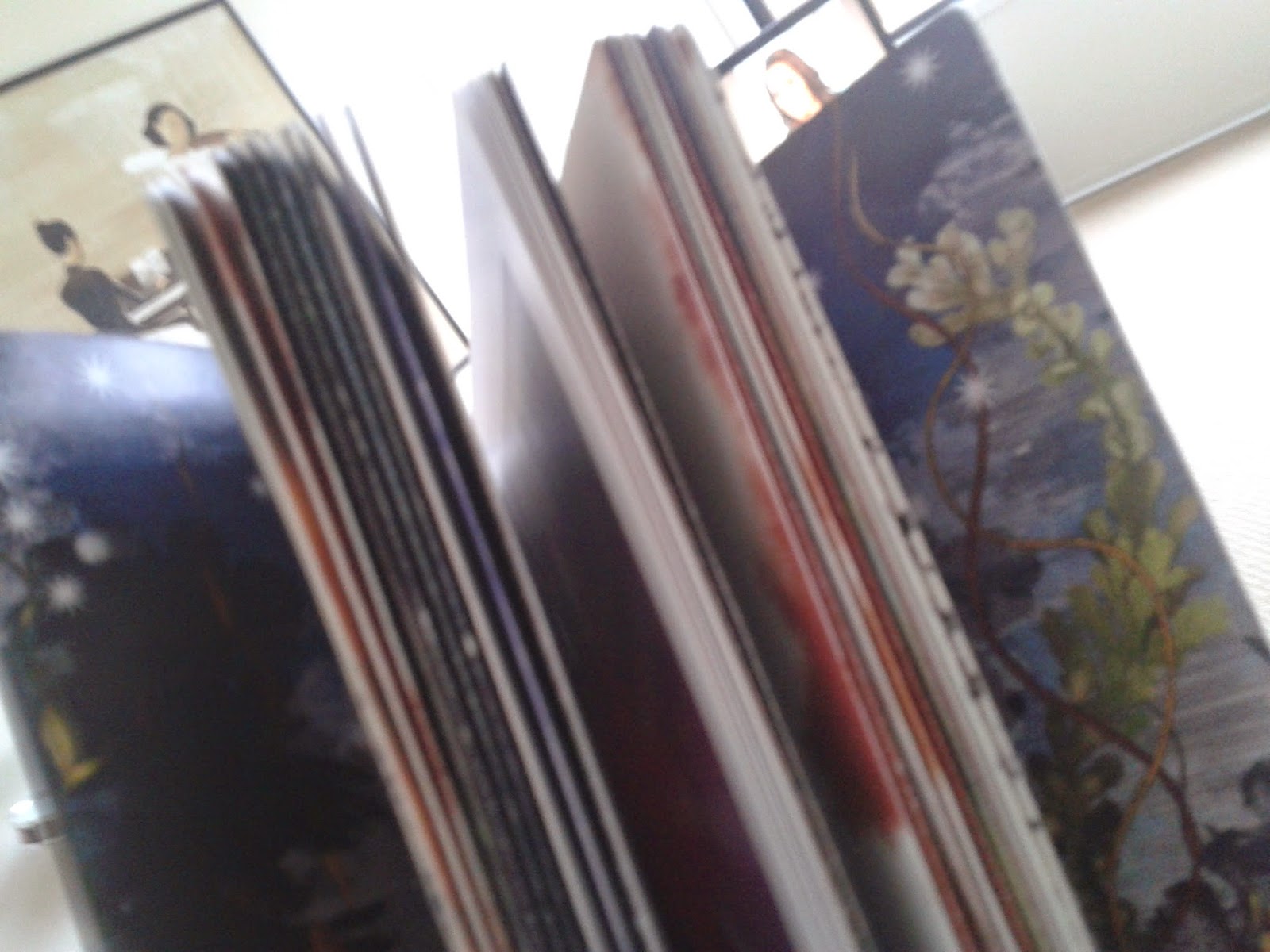
The entire Before the Dawn programme is just gorgeous, it even smells fantastic. I might have licked it, accidentally - doesn't really taste of anything. The cover illustration features the huge Moorish doors that descend upon the stage during the show, and the artist's mannequin, Tesoro (which in addition to meaning 'treasure' is also an anagram of 'Roseto', which means 'Rose Bush'), along with his puppet master. It's as suitably dark and muted, and Gothic, as much of the show is, and if you look carefully at the entrance, you’ll see the oil stain at the top of the door gives the shape the look of a keyhole.
The gorgeous End Papers, like the tickets provided to those who ordered using the Kate Bush mailing-list code, are printed with a specially commissioned design by Kate Bush and Timorous Beasties. It's quite clearly a labour of love, and at £15 it really was a bargain.
For Kate Bush fans, the programme makes for great reading, particularly the more intimate revelations, and reflections, about the way the Before the Dawn residency developed. I must admit, the thought of Kate Bush casually saying "Shall we do some live shows?" makes me crack one of the broadest smiles you are ever likely to witness. I'm doing it right now.

It has some really nice touches, and the hand-written headings and signatures, lend it an unexpected level of intimacy. A level of intimacy that also lets us eavesdrop on things like the conversation between the writer David Mitchell and Kate, as they work out the details of the life of the 'I' of The Ninth Wave, and Kate's, er, at times, sea-faring language. In many ways, it feels a little like a love letter from Kate to all her fans. It's also a surprisingly meaty, at around 60-pages of anecdotes, insights, and thoughts about the show, and how it took shape. In addition to aiding the programme's sturdiness, and helping achieve the washed-ashore look, many of the French-fold pages also have delightful little Easter-eggs hidden inside them.
One of the Easter eggs between the pages: Peek-a-boo Little Earth.
The thing is also full of wonderful drawings and plans and models and photos, including this one of almost the entire Chorus, featuring the fantastically talented Jacqui DuBois, Jo Servi, Sandra Marvin, and Bob Harms. I might have accidentally licked the back cover too, again, doesn't really taste of anything.
Kate Bush Live: Before the Dawn
Wittgenstein's hypothesis that "the limits of my language mean the limits of my world" certainly rang true for me, on the evening of September 2nd 2014. I left the Hammersmith Apollo, London, with my eldest daughter, after watching Kate Bush and her band perform Before the Dawn, and I could barely comprehend what I'd just witnessed, let alone describe it. This is why I have a certain amount of sympathy with the actress, Gemma Arterton, and singer/songwriter, Anna Calvi, both of whom the BBC's Newsnight invited into the studio to discuss the show's opening night, back on the 26th August. They were, I would imagine, on reflection, a little shell-shocked, and under the circumstances did a remarkably good job of at least trying to put what they had just seen into words. After all, what they had just seen was about as far removed from an ordinary pop concert as it is possible for a pop concert to be: part straight-up rock show, part movie, part video, part poetry recital, part performance art, part animation, part opera - it was simply impossible to neatly pigeon-hole the event into the kind of shorthand that passes for verbal communication these days.
What is all the more remarkable about my own inability to process the experience is that unlike the two still-stunned Newsnight guests, I had some advance knowledge of what I might be hearing, if not seeing. And yet, even armed with this possible knowledge of roughly what to expect, I left the venue, joyous and exhilarated to be sure, but also with the feeling that I had witnessed something rather remarkable, and even a little unreal. I'm convinced that the audience, including me, at various stages, would have looked a little like the theatre-goers in the movie version of Mel Brook's The Producers, when they first caught sight of Bialystock and Bloom's play 'Springtime for Hitler', but in a good way :)

The surreality of the event was not confined solely to the stage, either. Trust me, it's more than a little disconcerting when characters you usually see inhabiting Kate’s work, as two-dimensional images, suddenly start turning-up around you as fully fleshed-out human beings. It's very probably not that unusual to find yourself sitting next to Monty Python's Terry Jones on a night out in London, on other occasions, but because of his association with Kate Bush, his appearance at the show, just a couple of rows away, did have the effect of making an unreal event seem even more unreal. You see, Terry appears in Kate Bush's Director's Cut booklet, and on the Director's Cut album, as Professor Need, and that's why catching a glimpse of him out the corner of my eye, working his way along a row of seats in my general direction, almost completely negated the becalming effects of the dreamy pre-show music of Eberhard Weber. I felt a little like I'd entered the Twilight Zone, to be honest. A feeling compounded later, in the foyer during the interval, when long-time Kate Bush fan Big Boi, who I’d seen on TV a week or so earlier, singing along to a Kate Bush song on a mobile phone, in the BBC4 documentary ‘The Kate Bush Story: Running Up That Hill’, casually walked on by this dumbfounded spectator. Yes, even when there was nothing going on, on stage, an evening full of amazing surprises continued to deliver.
After the final encore, a sing-along with Kate Bush (yes, you read that right,"a sing-along with Kate Bush"); for many fans the most fantastically surreal of all the surreal moments of the evening, we left the place filled with joy, and almost to a man and woman, unable to say anything much except the odd 'Kin 'ell', and 'kin unbelievable' about the show, to one another. It really did seem, that night, to be beyond the vocabulary of almost everyone who witnessed the concert, to describe it - and a quick look at the #Katebush hashtag on Twitter will reveal that the phenomena has continued every single night since the concerts began. The tweets proclaiming "Wow, just wow" and "I have no words" appear unselfconsciously, time after time, from tweeter after tweeter. And there is a similar pattern on Facebook, as long-time Kate Bush fans try to express their feelings about the gigs.
~
The day after the opening of Before the Dawn, the show met with universal acclaim, but even seasoned music journalists and reporters seemed unsure of exactly what they'd seen. There were varying accounts of the opening number, some confusion about the running order of the songs, and in at least one case a song that wasn't played appeared on someone's set-list, whilst another number that was performed disappeared from one completely. In many quarters it went unnoticed that the song Albert McIntosh, (Kate's son), sang during A Sky of Honey, Tawny Moon, wasn't originally in the suite, and was newly-written for the show. But again, I am very sympathetic with this state of affairs, because it is proof, I would argue, that those journalists went along with Kate Bush's request that everyone leave their phones and tablets behind, in order to better engage with her, and the material. It's evidence, I think, that they didn't record the concert on their phones, or make copious written notes as the show unfolded, but that they played an active part in events, and then went home and tried to remember, and to then write about the experience, as best they could.
To my mind, writing a review of Before the Dawn, so quickly after the event, was an almost impossible task, and anyone who managed to do so deserves our utmost admiration. How exactly do you describe a show which morphed and transformed so spectacularly before your eyes, as it now begins to fade from your memory? How do you write about a singer who communicates her ideas with a tilt of her head, with a lighting effect, in English, French, Italian, German, Tongues, Do-Wop, Scat, Latin, backwards, and Bird Song - across different media? Not easily, that's for sure. You might get away with the odd word like fantastic or magnificent struck through with sous rature, but you can't resort to entire sentences, and paragraphs, and even entire pages, of impaled signifiers, declaring that every signifier on the page is wholly unsuitable for the concept it represents.
Language, after all, speaks mainly of comparison; it is our short-cut to meaning in this speedy age of instant and mass communication - and that presents us with a unique set of problems when we attempt to discuss something that is unlike anything else we have experienced. And the job of imparting any information is made all the more difficult to our post-literate generation, when there is no phone or tablet or notebook screen to hold up to someone's face and simply point to a screenshot and say, loudly, "that's what I'm talking about". Our response to this show, Before the Dawn, immediately, and before the release of the DVD, as a result of us having no film and no photographic references back to it, has illustrated, I believe, that we are often only partially experiencing some of the moments of our lives that we wrongly believe we are fully living. When we are experiencing an event performed live before us, through the intermediary of technology, we are removing ourselves from the experience in a way that does not happen when we actually engage directly in looking at, and thinking about, what is actually going on. Not for the first time then, Kate Bush has, by blowing our minds and asking us not to film her doing so, used her art to force us to think a little harder.
Of course, we can’t rule out the possibility, and I haven’t, that the event was impossible to put into words because ‘almost’ all of us watching, experienced the sublime, which is ineffable.
Kate Bush Live-Before the Dawn: Act I - Part 1
Before the Dawn is in two parts, but also thematically in three parts. The introductory songs, (seemingly) unconnected to the two major suites, are nonetheless largely drawn from the same two hugely successful and critically acclaimed albums, Hounds of Love (Hounds of Love and Running up that Hill), and Aerial (Joanni and King of the Mountain), with the other two songs, Lily and Top of the City, both coming from the album The Red Shoes, and more recently Director's Cut (2011) where they were re-recorded and given a "warmer, fuller, sound" than Kate felt they had on the digitally-recorded The Red Shoes.
1. Lily
2. Hounds of Love
3. Joanni
4. Top of the City
5. Running Up That Hill (A Deal with God)
6. King of the Mountain
The Ninth Wave
1. Video Interlude - And Dream of Sheep
2. Under Ice
3. Waking the Witch
4. Watching You Without Me
5. Little Light (Performed by Backing Vocalists)
6. Jig of Life
7. Hello Earth
8. The Morning Fog
A Sky of Honey
1. Prelude
2. Prologue
3. An Architect's Dream
4. The Painter's Link
5. Sunset
6. Aerial Tal
7. Somewhere in Between
8. Tawny Moon (performed by Albert McIntosh)
9. Nocturne
10. Aerial
Encore
1. Among Angels
2. Cloudbusting
~
As the cheering subsides there are a few nervous, excited, giggles as a creepy, somewhat ominous sound, fills the venue. It actually sounds as if a horror movie is beginning. It's an unearthly sound. There's a swishing, like the pendulum cutting through the air of the pit in Poe's tale. It's Lily, the Director's Cut version. The late Lily Cornford's voice is heard reciting the version of the Gayatri Mantra written by one of the founders of the original Theosophical Society, William Quan Judge (April 13, 1851 – March 21, 1896). The Gayatri mantra, one of the oldest Sanskrit mantras can, amongst other things, protect the chanter from all adverse situations:
Oh thou, who givest sustenance to the universe,
From whom all things proceed,
To whom all things return,
Unveil to us, the face of the true spiritual sun,
Hidden by a disk of golden light,
That we may know the truth,
And do our whole duty,
As we journey to thy sacred seat.
It kicks off, and the band kicks in, and the cheers go up again, and Kate is welcomed centre-stage with an enormous roar, the first of many ovations. By the time she delivers the line "I'll show you how with FIRE" some of us are on our feet again. Her voice absolutely soars. It's so much bigger now, so nuanced, so strong, so confident, so full of colour, and so very, very, big, and when she's into the "...veil of DARKNESS" some audiences members are elevated up out of their seats again by the sheer power of her delivery. If the show stopped now it would be okay, it would be enough.
Lily is the perfect opening number - what a brilliant idea to start with it. The mantra aside, the song itself is also a protection spell, or at least it's derived from one, as filtered through Dion Fortune, and the brilliantly OTT Hammer Horror version of Dennis Wheatley's story 'The Devil Rides Out'. The Archangels Gabriel, Raphael, Michael, and Uriel, are called upon for protection, with more than a little tongue-in-cheek-humour, and a little pinch of salt. It's a fantastic rendition, drawing on Kate's stronger deeper range, and it's a quick introduction to us of the skills of Omar Hakim on drums, Mino Cinelu on percussion, and the rest of the brilliant band; David Rhodes Frissi Karlsson, John Giblin, Jon Carin, and 1979 Tour of Life veteran, Kevin McAlea. The soaring harmonies of the Chorus; Albert McIntosh, Sandra Marvin, Jacqui DuBois, Bob Harms, and Jo Servi, are rich and joyous. They're a tight unit, confident. What a truly brilliant start. This opening number would be an encore for many bands. The atmosphere is electrifying. We're one song in and I'm feeling very sorry for anyone who gave their ticket up for the reported £1500 that was there to be had - the money will be spent all too quickly, but the memory of the moment Kate Bush returned to the concert stage will stay with those of who witnessed it, forever.

Next up is the huge hit Hounds of Love, the title song from the #1 selling album of the same name, from 1985. Since its release, the album has been voted one of the greatest albums of all time, in a number of music polls, and has been a fan favourite since it first hit the shelves. The following year, 1986, the album was nominated for Best Album at the Brit Awards, with Kate Bush also nominated for Best Producer and for Best Female Artist, and another single from the album Running up that Hill, was nominated for Best Single. Again, pleasingly for a Kate Bush-nerd like me, there's a connection with another British horror classic, Night of the Demon, based on the story Casting the Runes, by the medievalist scholar and writer, M.R. James.
The band is lead into Hounds by Omar Hakim tapping his sticks, and then he's quickly hitting the rhythm. He's brilliant to watch live, a real artist, Mino Cinelu too; both have grace, style and power, in abundance, and together, they are simply fantastic. This is another show-stopper, and again it would be an encore for many other performers. She has such a wealth of material. Her vocal is, again, near perfect, her diction flawless. But there's an unfamiliar line in there, or maybe it's always there and I haven't noticed it before - I can't remember. It's "tie me to the mast". This is interesting, it's the instruction Ulysses gives to his crew to stop him being seduced by the song of the Sirens – of course it works in the context of the song, but is it perhaps a little wink to The Ninth Wave to come? Of course any mention of Ulysses also puts us in mind of another of Kate's songs, two others in fact, filtered through James Joyce, The Sensual World, and Flower of the Mountain. Oh, this a really fabulous version of Hounds of Love, a song we thought we would never hear live, and it's a big, meaty, version, about a million times better because she's actually here, a few feet away, singing it. The Chorus is barked-out, literally, and it sounds fabulous. What a winning-touch. This is some outfit; it feels like they've been together forever. We're up on our feet again. I think maybe we should just stay up on them.

Straight into drumming, percussion, such wonderful textures, the sonorous sliding sound of bells, and another ominous hum, and this time a muffled, distant, strangled, scream. Again, like the intro to Lily, it's a little eerie. Some of the audience are unsure what this number is until Kate sings of all the waving "banners", and the flying flags and the "thousands of soldiers". It's Joanni, one of the highlights from side one, A Sea of Honey, from the album regarded by many as Kate's masterpiece, Aerial. Joanni, a song about the French heroine, martyr, and Roman Catholic saint, Joan of Arc (1412 – 30 May 1431), is not, as one reviewer suggested, a tribute to Joni Mitchell, whom ,whilst one does, with perhaps the exception of Alan Partridge, associate her with some beautiful songs, one seldom associates her with soldiers, armour, and flags, horses, and canon.

Joanni is much richer here, live, than it is on the album. The music map is foregrounded, the intro' stretched, and in the lower key it's even more fabulous. In fact it's spellbinding. I swear, this is going to make my heart burst through my chest. What a performance, it's exhilarating. The band is incredible. The lighting is adding so much, with the suggestion of church windows and medieval Keep Arrow-Loops that morph into fiery crosses. The sound of the Bells of Rouen playing on Joan of Arc Day (a recording of them Kevin McAlea made and plays through his keyboard) are subtle in Joanni, more of a subtext than might have been the case had the song been created by someone else. Their song echoing through other songs over the course of the two suites that lie ahead.
The image of the teenage Maid of Orleans, riding to the front of the amassed troops, thousands strong, who fall into silence and strain to catch a glimpse of the teenage girl's face - much as those of us here in row FF of the Apollo are doing with Kate, is very, very, powerful, and an excellent example of how Kate Bush's art often reflects back a celebratory image of strong, independent, and heroic, female protagonists.
The Chorus and the band are brilliant here, the music feels so full, the Backline of Chris Lawson, Morton 'Turbo' Thobro, and Steve Gray, must all be helping power it along. And Kate's vocal is so impressive, so emotive, so full of colour. The song is a revelation sung live like this, it's so beautiful. Parts of the harmony are simple humming, much softer than on the original where it is just Kate backing herself, and it's an amazing sound. I have something in my eye.
The lighting, the FX, much of the imagery prefigures what's to come later with A Sky of Honey, as the flaming arrows turn into birds in flight. She's singing in French, calling Saints now to accompany the Arch Angels summoned earlier, St Catherine of the Wheel, and St Margaret of Antioch. There's a link with an earlier song in the set, Lily, in that the first heavenly visitation Joan claimed to have was from the Archangel Michael. One unavoidable image in the back of our minds, even deep in our subconscious, is of the martyred Saint Joan, tied to the burning post, and that too harks back to the image in Hounds of Love of the 'I' of the song being tied to the mast. The imagery is surely deliberate, but where are we going? This is incredible; it's outrageously good by any measurable standard. This is a standout song for me from this part of the set for me - whatever follows.

Up to The Top of the City, is the answer to the question "where are we going"? Top of the City, like Lily, is from Kate's album The Red Shoes, and also Director's Cut. The angel in this song is real, or at least more solid than one usually imagines angels to be. This one has pigeons on it, and is a vantage point from which to watch the hell of the city below, with people going about their everyday business, in an omniscient fashion. It's an escape up there toward Heaven, and it has always connoted the Wim Wenders movie Wings of Desire, for me - where invisible, immortal, angels wonder through Berlin gazing down on the city and listening to the thoughts of the human inhabitants.

The song here, in the hands of this band, sounds hugely impressive, it's vast, filling the place, and it could easily be a gospel classic, it's so big and all-encompassing. They are a very versatile and accomplished outfit. Again, Kate's voice is massive, soaring, and so very impressive. People are spontaneously clapping all over the place here. Our heads are now filled with images of Heaven and Hell, of statues of angels, of angels atop angel's shoulders, of archangels and saints, of martyred women. The show is rich with imagery, and the surround sound and the lighting are all combining to create an immersive experience, and we're only four songs into a set, with relatively few frills, that may well be about three hours long. I begin to fear for Kate's voice, and for my little heart, because the song is yet another knock-out, and yet another show-stopper, and yet another song that could have been a show-finishing encore.
The beginning of Running Up That Hill is now very familiar, and it's met with a huge roar and another ovation, and some continued clapping to the beat, which respectfully falls away, thank goodness, as Kate begins to sing. Again, Kate's vocal is outstanding. Like many here this has long been a favourite of mine, and it's a brilliant version, and hearing it live makes it even more special - but this isn't testing her the way some of her other songs have thus far. I think it's because there's less room to play with a song as well-known as this. What it does though, is show Omar Hakem and Mino Cinelu applying their art, and laying into the beat, and that's truly a fabulous sight and sound. Again, as in Top of the City, Heaven is invoked, as the "Deal with God" is repeated throughout the song. More than ever, in this set, alongside these other numbers, the original name Kate gave the song seems more appropriate than the record company's preferred title 'Running up that Hill'. I think from now on I may well call it "Deal with God". One thing I did notice is that the dissonance that usually sets in at the end of the song, where the music seems to try to work against Kate's vocal, doesn't happen here - it plays out in a straight-forward fashion and gets everyone up on their feet for yet another standing ovation.
Guitar intro for the first time, and it disguises, momentarily, the beginning of King of the Mountain, also taken from Aerial's 'A Sea of Honey'. It's a good choice because the many Kate Bush fans who have made the journey over from the US, solely to see her perform, love it, plus the vocal is really testing her range. Another revelation live, it's absolutely fantastic. Suddenly everyone on stage is more animated, and Kate's clearly really enjoying herself out there. She's even playing with the sound she's making of the word 'wind'. The chorus is getting right up there, this is sheer joy. Kate seemed to be in a sort of Janice Joplin or Stevie Nick's mode, black-tassels swinging as she spins - but no, wait, there's something else going on here. Kate is whipping up a storm, she's invoking the wind. And now somehow, she seems more like that blackbird in the water, unable to fly, spinning in circles. She's winding up the elements. This is going through the roof. All sorts of images are conjured up now, she's Prospero, initiating the tempest, creating the storm, and inviting the crashing thunder. Omar Hakim is knocking it out the park.
It suddenly strikes me that this is the third song in a row where we are climbing up, up a hill, up to the top of the City, up to the top of the mountain, and now the music, the wind, and the storm, are building up, up, too, to impossible heights. It's getting very wild and surreal. Suddenly, Mino Cinelu, has stridden out to the front of the stage, as Kate takes a back seat. He is tall and imposing, and looks more so in the eerie lighting. He's turned his back to the audience, his legs look impossibly long in the strange light, and his long-braided hair is swinging as he swings a bullroarer, an ancient instrument, sacred in Ancient Greece, where it played a role in the ceremonies of the cult of Cybele. Kate used one on The Dreaming album. It all looks fantastic, and it's wonderfully disconcerting, unheimliche, as it roars unsettlingly and thunder peels, and waves crash. Somewhere, in the darkness, a ship is creaking and breaking up. There are crashing noises, and what appear to be canon fire as slips of paper shoot into the air and then fall to the ground. They contain a quote from Alfred Lord Tennyson's poem, The Coming of Arthur ( I didn't get any confetti on the night, but thanks to the very generous Kate Bush superfan Stephen Schweckendieck I, and some other unfortunate souls, now have some):

Wave after wave,
and all the wave was in a flame.
It's an incredible moment. Kate has used the storm in King of the Mountain not just to blow through Elvis's deserted house, in the song, but to launch us into The Ninth Wave: her conceptual suite about a woman lost at sea, adrift, lonely, cold and scared, with only her imagination for company as she tries desperately not to fall asleep, and drift off on the wild white horses that are the froth-topped waves of a storm-hit sea. It's as if the venue itself has taken a massive intake of breath. I've lost count of the amount of ovations. The Ninth Wave has begun.
Kate Bush Live-Before the Dawn-Act I - Part 2
The Ninth Wave
There are two aspects to the sublime, awe in the beautiful forms of nature, and also terror. In his poem 'Lines Composed a Few Miles above Tintern Abbey', William Wordsworth expresses his joy in the 'blessed mood' of the sublime, but also his understanding that transcendence from "the heavy and weary weight Of all this unintelligible world" is but a moment, transient. That moment will pass, and in the passing of the moment he will have aged, and the world will again be just as unintelligible as it was before that moment, and the mood, overtook him. For Wordsworth, the ultimate goal is to find Enlightenment within that moment, and to express that moment in words and images to the reader, or the listener.
When Eugene Delacroix wrote in his journal, in 1857, that "The terrible is like the sublime: it is not to be abused.", he was simply reasserting Edmund Burke's hypothesis that the "...passion caused by the great and sublime in nature . . . is Astonishment; and astonishment is that state of the soul, in which all its motions are suspended, with some degree of horror..." (On the Sublime, 1756). The Sublime has never been limited simply to the beautiful; it can be experienced in anything that creates an emotional understanding that transcends rational thought.
Act I of Kate Bush's show, Before the Dawn, The Ninth Wave, is seldom referred to as sublime in reviews, though Act II, A Sky of Honey, often is, perhaps because of its associations with sunshine and light and colour, it's 'Songs of Innocence' qualities, if you will, as opposed to the 'Songs of Experience'-like qualities of the work that deals with shipwrecks, unconsciousness, witch trials, and drowning. And yet, from the very beginning, the philosophical debate around the sublime has centred around the sea, shipwrecks, and fear, as much as a preoccupation with the beautiful. In 'Philosophical Enquiry into Our Ideas of the Sublime and Beautiful (1757) Burke's concept of terror in the sublime, is symbolised by the ocean, and he goes on to say that it is terror that is "...the ruling principle of the sublime", and that the waters must "...be troubled before they can exert their virtues...". The belief that the sublime can actually only be experienced looking at art that involves the duality of beauty and terror, troubled waters, a degree of fear, then, is as old as the philosophical debate about the sublime itself. In her essay 'Shipwreck, Self-preservation and the Sublime', Christine Riding talks of how the "...primary preoccupation of artists and poets in presenting shipwreck subjects is the attempt to immerse or transport the viewer out of their own time and space and into the description or composition." Something Kate Bush manages to great effect in The Ninth Wave, as evidenced by the sheer number of viewers/listeners who are moved to tears during the performance.
~
In case anyone assumes I have suddenly developed a photographic memory, let me assure you this is not the case (although my memory is sometimes freakishly good). The marvellous Will O'Mailley started a thread in our little Fish People Kate Bush fan group, to discuss the ghosts of other songs that haunted Before the Dawn, and that we might have spotted on the various nights on which we attended the show. I have, therefore, Will O'Malley, Stephanie Foster, Paula Mackay, Michelle Shine, Eddy Ophelius, Caleb Lane, Zee Zetteke, Peter Sioen, Amanda Greenway Harrold, and Tomasz Grotnik to thank for noting some of the intertextual delights of some songs in the show.
Suddenly the stage is now a film screen. The detritus from the wrecked ship, the confetti with the quote from Tennyson’s poem on it, is scattered all around. The screen comes to life, an astronomer, played by Kevin Doyle, out watching the Perseids meteor shower, has heard a distress signal from the captain of the ship, the Celtic Deep, and he is attempting to alert the coastguard. The only co-ordinates he can make out are 7 and 9, '79'. A reference, perhaps to the year 1979, the year Kate Bush disappeared from live concerts? The static at the end of his call isn't just "staticy" (to use a Kate-Bushism) it is gremlin-filled and slightly diabolical, in a Waking the Witch sort of way, clearly signalling that there will be difficulties ahead before the piece reaches its joyful resolution.
Then whoosh, in another strange and uncanny moment, Kate Bush, the triumphantly returned pop star singing her songs live on stage in the time-honoured traditional fashion after 35 years, is now transformed into Kate Bush, the pop star, playing the part of her protagonist, the marine biologist from the Ninth Wave narrative, on a giant screen. A beacon sends out its steady pulse, and counts in the achingly beautiful notes of And Dream Of Sheep, which in turn usher in the words we Kate Bush fans have longed to hear live on stage since 1986, the words we thought for a very long time we would never, ever, hear live, 'little light, shining...'. There is sudden applause, knowledgeable applause, because it ends quickly in order to savour every further note. It is an extraordinary rendition of this incredibly moving song. She has actually suffered to bring this song to us. She's up there, larger than life, lost, cast-adrift, Ophelia-like, she floats, her hair spread around her, her teeth chattering, the cold water making her voice, recorded live in the water when the piece was filmed, hauntingly human and falteringly beautiful. People are literally on the edge of their seats, as between phrases she catches her breath, and all around me I can hear sobbing. It's very moving.

Under Ice begins slowly, steadily, like a skater building momentum, side-to-side, skating over a frozen surface. This is a like an amazing journey through the creative landscape Kate navigated for us as she created the work. It's a startling insight into what she saw while she was working on the piece. Whilst Kate's protagonist drifts helpless, bobbing in and out of a realm somewhere in between waking and dream, between life and death, fantasy and reality, drifting in and out of consciousness and her body, the imagination she is afraid of being left alone with, fights against her. Kate herself is back on stage again, but not as Kate Bush the singer, singing her hits, or Kate Bush the actor performing the character from The Ninth Wave on screen, but as Kate Bush the stage performer, singing live, as the protagonist from The Ninth Wave. If I wasn’t afraid of being made to stand in Private Eye’s Pseud’s Corner for doing so, I’d describe Kate Bush’s Before the Dawn, as the most Brechtian experience I've had since I watched I Bertolt Brecht in a small room, with a member of Brecht's family watching from the wings.
The Chorus is wonderful here, they are so versatile, the sound is very operatic, the music repetitive and hypnotic. Somewhere between life and death, between dream and reality, the 'I' of the piece is following her would-be rescuers, who are tracking something, a person, trapped beneath the frozen ice. Out of her body, she sees that it's her trapped under the ice, whisked past at speed, toboggan-style, by undersea currents - "it's ME!", she sings "it's Me!". It's such a dark song, so Gothic. In a quite spectacular way she is freed only to be whisked away by the skeletal Fish People.
The song Waking the Witch, which sees the protagonist's trial at the hands of Jo Servi's brilliant and terrifying Witchfinder, is truly the stuff of nightmares. The set looks like a wrecked hollowed out ship, skeletal, or even the ribs of a whale, and it casts beautiful and eerie shadows. Meanwhile somewhere, out there in the darkness Bush's character drifts in and out of consciousness, and in and out of reality and dream, and all the while, over here, in the dreamtime, she is forced to plead her case as memories of old sea shanties, nursery rhymes, and old Latin school lessons, become mangled in the memories of the past, the present, and the future. She becomes a drowning blackbird, condemned as a witch by the assembled spirits, as reality intercedes in the form of the coastguard's announcements, and the noise and lights of the searching helicopters. By now we have learned that everyone else from the floundered Celtic Deep has been rescued by the coastguard, voiced by Paddy Bush, incorporating a fantastically innovative helicopter effect designed by Mark Henderson. This is a triumph of music and movement, of staging and lighting, and technology and song-craft. It's a potent brew.
Watching You Without Me, begins not with the song, but with a dreamlike domestic set-up, complete with a TV gliding side-to-side in a slow hypnotic wave-like motion. Although it’s much more fantastical a set than he might have used, there is something a little Beckett-like about the shenanigans, and sausagey-ruminations (a playful reference to 'strumento di porco'?), of the protagonist’s husband and son, played by Albert McIntosh and Bob Harms. The piece is both funny and absurd, and also poignant, as the woman’s son and husband also represent the friendly-voiced, silly conversations, she would have tuned into on her radio, if she'd had it for company. There's even an extra nod here to those fanatical fans who obsessively analyse every song lyric (Who they? Ed.) with the description of the missing folder as "big and pink", a line that also appeared in the song Pull out the Pin. (Jungians only in the comments section, please, all Freudians are banned ;) )
There is spontaneous applause when Kate magically appears on the set, as the ghost in the house, to deliver the song, which opens with very seductive bongo-playing, and harmonies. Yet again, the woman becomes aware of her own other-worldness, just as she did in Under Ice, only this time it’s her absence she notices. An SOS runs through the song in parts, as do the sound of seagulls, and the backward lyric of "Don't ignore, don't ignore me. Let me in, and don't be long." as once again reality interrupts the fog of dream. This is a pivotal moment, these people are the reason she will draw on all her reserves in her attempt to fight off sleep, and her sometimes destructive memories and imagination, and remain alive. Her imploring ghostly vocal, the poignant lyrics, the moment when she tries unsuccessfully to touch her son, all combine to see her stiffen her resolve, to demand that she be allowed to live. Seeing the drama played out in this fashion, with these amazing sets, the fantastic cast, Kate's voice, the wonderful Chorus, the lasers, the lighting, the SFX, this doesn’t just breathe new life into these songs, it expands them, giving them an added dimension, making Kate's original vision clearer to us.
Jig of life, with its live Uilleann piping by Kevin McAlea, offers a tension between the tune, which is joyful (although the sinister overtones of The Red Shoes are never far from our thoughts) and sees the audience clapping along, and the supernatural element of the lyrics, where the 'I' of the song, as an old woman, is haunting herself. All the while, there's the beeping of the beacon in the background, a reminder that out there, in the darkness, the woman is still in limbo. Just then, as the jig becomes a fading lament and the beacon-sound becomes stronger, there’s a perversely joyful and unsettling moment as the head of John Carder Bush makes a disembodied video appearance on the askew TV, to pick up the line 'Over here' and, rather spectacularly deliver his poem:
Over here!
Over here!
Can't you see where memories are kept bright?
Tripping on the water like a laughing girl.
Time in her eyes is spawning past life,
One with the ocean and the woman unfurled,
Holding all the love that waits for you here...
There follows a truly haunting version of Hello Earth, which sees the 'I' of the song clinging for life to a buoy, and then eventually elevated figuratively above the ocean, and literally above the audience. The band, and the drumming in particular, is just marvellous here, and the Chorus is absolutely outstanding. This is high-drama, and unforgettable theatre, from the song itself, to the dreamlike climax when the ‘I’ is carried off in a death procession, as Gabi Zangerl whispers, in German, "deeper, deeper, somewhere in the depth there is a light.". When the woman reappears minutes later, reborn, as Kate heads back toward the stage, the audience is again ecstatic and clapping wildly, as almost imperceptibly the beat of The Morning Fog, the climax to The Ninth Wave, has already begun.

The Morning Fog, the finale to The Ninth Wave, opens with the lyric "The light/Begin to bleed/Begin to Breathe/Begin to speak…", as the character is reborn into ‘the sweet morning fog’. The song is her reaffirmation of her love and devotion to her family, and friends, and this is made all the more moving because the singer's own beloved son is right there on stage with her. Many of the people around me have tears running down their faces, as Kate, with somewhere around 20 of the fellowship out there on stage with her, sings the line, "I love you better now". This acoustic number, with its warm accordion, has even the once terrifying Fish People, their headpieces to the side, joining Kate and the Chorus and cast, in their slow, deliberate, dance of celebration, in front of the stage and the skeletal ship set, in a truly joyous finale. The Ninth Wave has been a long time coming, but by god it was worth the wait.
Kate Bush Live-Before the Dawn - Act 2
Aerial: A Sky of Honey

I love Aerial, it’s a fantastic album. On its release at the end of 2005 it entered the UK Albums Chart at number three, selling more than 90,000 copies in its first week of release. The following year, Kate was nominated for two Brit Awards for Best British Female Solo Artist, and Best British Album. Worldwide the album has sold well in excess of 1,000,000 copies. And I especially love A Sky of Honey, which takes up the entire B-side of the album. It’s an extraordinary work, from an album regarded by many, rightly I think, as Bush’s masterpiece. The impressionistic piece follows the progression of light and shadow during a single day, through which the birds play, and a painter attempts to capture one particular moment in time - perhaps to the exclusion of those around him, personified in Before the Dawn, by Tesoro, the artist’s mannequin. A fan of James Joyce’s novel Ulysses, which also takes place over a single day in Bloom’s life, Bush surely has, with A Sky of Honey, come very close to creating a work of art as stimulating and awe-inspiring, as that remarkable book.
After the interval, the curtain retreats in surprising fashion, and a cheer goes up. As the clapping subsides, two huge Moorish doors, those seen on the cover of the Before the Dawn programme, creak open, to the sound, somewhat unexpectedly, of the intro of 50 Words for Snow*, from the album of the same name - an artist’s wooden mannequin, the size of a child, walks through them, controlled by a puppeteer who follows him (Personally, I’ve always wondered about a possible link between the album’s name, and the character Ariel, the sprite from Shakespeare's The Tempest, but it was always no more than a passing fancy. Until I saw Tesoro, a wooden boy, that is. In The Tempest, the magician Prospero rescued Ariel from a tree he was imprisoned in. It might be, at another time, worth thinking about.) . Slowly, the sound of birds singing wins the day, and 50 Words dissipates as A Sky of Honey begins, with Prelude - Kate’s solo piano mimics the sound of the birds, who appear to be singing something like "Don’t Grow Old Bertie" and Bush’s son says, "Mummy, Daddy, the day is full of birds…sounds like they’re saying words". A shadow is cast though, perhaps by a cloud covering the sun and it is reflected in the melody; an early reminder, perhaps, that such perfect moments pass all too quickly.
*The 50 Words for Snow intro' appearing here, is a nice reminder of the presence of one of Kate's 'Snowmen', the incredibly talented Stephen W Tayler of Chimera Arts, Kate Bush's 'Vocal Navigator' during Before the Dawn, and the man who mixed the '50 Words for Snow' album (and 'worked on 'Director's Cut' tracks and the 2012 remix of Running Up That Hill.) His discography of work is truly eye-popping.
Experienced live, Prologue is even more beautiful than you can ever imagine. It is beauty beyond words. Kate’s live vocal, along with individual instruments playing the part of different bird-songs, that haunting melody, and the animations and accompanying films, almost produce a sensory overload. We do hear "the lark ascending", and now, our minds-eye a little more open, we can perhaps even see a little more of what Vaughan Williams imagined when George Meredith’s Eucharistic poem inspired his "pastoral romance for orchestra":
He rises and begins to round,
He drops the silver chain of sound,
Of many links without a break,
In chirrup, whistle, slur and shake.
For singing till his heaven fills,
‘Tis love of earth that he instils,
And ever winging up and up,
Our valley is his golden cup
And he the wine which overflows
to lift us with him as he goes.
Till lost on his aerial rings
In light, and then the fancy sings.
As the "lovely afternoon" unfolds "Like some kind of magic /Like the light in Italy /Lost its way across the sea," it slowly rises to a crescendo, complete with beautiful pastoral bells, and Kate becoming a bell (so glorious), and then the drums and the rising Chorus all chime in, and people can’t help applauding during this, and in a way that hesitant, almost involuntary applause during the song, mimics the pattern as it too rises from the first ripple to swell into a huge ovation at the invitation to follow the story of "the oil and the brush".
The slow and steady An Architect's Dream, opens with Albert McIntosh, ‘the Sun’ on Aerial when he was a young boy, now grown up and, somewhat fittingly, cast in the role of the painter, his anger toward his mannequin perhaps illustrating that it is often true that artists can become selfish in the pursuit of their art, neglecting those around them. Like the darkness drifting over the sky, those "dark accents coming in from the side.", there is also light and darkness in the creator. The percussion here, live, is every bit as delicate and dreamlike as it is on the CD, perhaps more so. It is a world moving in slow motion, as the painter paints on, regardless of that fact that scene has now changed with the changing weather "It's always the same /Whenever he works on a pavement it starts to rain.", his toil a triumph of hope over experience. Another ovation, and no wonder, that was simply stunning.
With The Painter's Link, Albert McIntosh’s character laments the rain's effect on his work as "…all the colours run, all the colours run, see what they have become?" but the serendipitous action creates the favourite work of Kate as narrator. All the colours of this brilliant set run into each other too, and the Autumnal shades are reflected in the costumes. It's almost as if a painting, an Impressionist painting, has come to life. I'm reminded of Lech Majewski's movie The Mill and the Cross, a beautiful film based on Michael Francis Gibson's book, of the same name, where Pieter Bruegel the Elder's 1564 painting The Procession to Calvary, seems to have been brought to life. This show is every bit as beautiful.

Sunset is greeted with immediate applause. Here Kate sings an ode to the blackbird, a creature that features in both The Ninth Wave and A Sky of Honey. This is a beautiful song, iridescent; it shimmers with the reflected sunlight of the "sea of honey/ a sky of honey." But there is a dark-side to this song, it is in many ways elegiac, a Memento mori, a reminder that all life turns, inevitably, back to dust. There’s a hint of Blake’s questioning in the poem ‘Tyger’, from ‘Songs of Experience’ with "What immortal hand or eye/Could frame thy fearful symmetry?" reflected in Kate’s lyric "Who knows who wrote that song of Summer…". The audience applaud as the song pauses, before the tempo change and the Chorus joins the now absolutely joyous flamenco celebration and the applause turns into wild clapping along with the beat as the song goes up, up, up to the top of the sky.
In many ways the beginning of Aerial Tal is creepier-sounding than the start of any other song on the set. The ominous beats of the drum and dark percussion continuing even after the birds have begun their game of ‘peek-a-boo, bird in a tree’ with Kate, who speaks back in the language of birds. Even after the birds call to ‘Bertie’ and he responds with laughter, there is an unmistakably sinister quality to the piece, like the best Grimm fairytale.
Somewhere In Between, is a song I love even better now, because in many ways it is the key to both The Ninth Wave and A Sky of Honey. It binds the two pieces in a similar way to the Timorous Beasties poster on the inside cover of Before the Dawn’s programme, where the blackbirds singing their song at dusk are in the foreground, while the coastguard searching for the protagonist of The Ninth Wave hover in the distance. Again, it’s a song about climbing up to the highest height, and it’s an incredible celebration of life itself, that space between that first breath in, and that final breath out.
Tawny Moon is an addition to A Sky of Honey, which increases the role of the artist in the narrative. It’s a song that combines the traditionally female association of the Moon, with very masculine imagery, but retains the Moon’s female aspect with the artist’s love for her. It was written for Albert McIntosh, in a role that was, arguably, tailor-made for him. How could the painter be played by anyone else, considering his associations with the album, and the creator? He’s perfect for the role, but it helps immeasurably that he has the confidence, and the talent to do the song justice. I can’t help thinking about Monty Python’s sketch about what the Romans did for us when I think of Bertie. I mean, apart from helping to make the original Aerial album, and booklet, such a delight, and helping make 50 Words for Snow so perfect with his work on Snowflake, keeping his mother happy, encouraging his mother to return to the stage with Before the Dawn, and performing the task of Creative Advisor on the show, along with his role as ‘the painter’ and as a member of that stonking Chorus – what has Albert McIntosh ever done for us? We Kate Bush fans will be eternally grateful.
Like Sunset before it, Nocturn is greeted with immediate applause. I am transported when Kate sings ‘…into the Moonlight’ and the song washes over me. I’m paying a lot more attention to the band and the Chorus and cast than you can tell from reading this, and I’m really loving Omar’s drumming, but I’m gone, I’m floating. Even as we metaphorically swim further and further out, diving "deeper and deeper…" into this dream, I’m touching the sky. The dream takes on dark possibilities as the ‘I’ of this song also becomes the ‘…Blackbird with a stone around her leg’, just as the ‘I’ in ‘Waking the Witch’ did. Are they the same protagonist? Is it the same shared dream? Don’t you just love the many layers in Kate Bush’s work? But the Sun is rising again, over the horizon, creating the sea and the sky of honey, its light shooting up over the buildings, over the windows, over the aerial, and awakening the dreamers of the world.

The crowing cock, the insistent rhythm, and the church bells signal the start of the day, and the start of Aerial. The dawn has come, and the song of the day has begun, and Kate hits that top note on the word ‘Sun’ and it takes off. The thumping beat takes us up, up, toward the roof. The band and the cast, look and sound fantastic. They are transforming into birds, as Kate laughs while the birds sing, ‘hurdy, gurdy, Bertie’ crack jokes, and play ‘Peek-boo can’t see me’. We are heading relentlessly toward the glorious climax of Aerial. The protagonist wants to follow the light up to the rooftops, up to the sky, she is transforming, shape-shifting – "What kind of language is this?" She asks. She has donned her clock of raven wings, ‘her beautiful wings’ to go up there, up on the roof, and join in with the joy of the birds. She is laughing deliriously, as she transforms into a character not unlike The Morrígan (the great goddess) from Irish mythology, who donned her coat of raven wings to transform into a bird, in order to fly above in a search for enlightenment. Oh my god, what a finale. This, you just have to see for yourself. The venue erupts and the ovation, rightly, seems to go on forever.
I've added this (again something people reviewing a show, in print, to a deadline, don't have the luxury of) because I don't want to underplay the importance of the entire band, and David Rhodes, in particular, in the latter stages of Act II. Anyone who has seen David perform with Peter Gabriel, and others, will know that he's an eye-catching performer, but I'm sure, like me, they will still have been knocked-out, not just by his playing, but by his role-playing and total immersion in the part of a
musician turning into a bird.
The show is bookended to a close by two encores; the first of which is the beautiful ballad Among Angels, the final track on the marvellous album 50 Words for Snow. It’s worth mentioning now that there is an enormous tree growing right through Kate’s piano, which should give those of you who remember her bone meal joke (I think to John Wilson), when she was promoting 50 Words for Snow, a bit of a kick. This is our opportunity to hear the song exactly as it was recorded, live at the piano, in one take, and it is staggeringly beautiful. It’s a real privilege to be able to hear and see her there at her piano, in her element. I think I might well have paid the entrance fee just to witness her perform this one song. And then, completely unexpectedly, we are all brought together, in perhaps the most surprising move of the evening, to sing along with a stirring, almost marching band-like rendition of Cloudbusting, a tribute to maverick, single-minded, originality. Yeyeyo, indeed.
The world is great, life is great. Kate Bush is smiling at us, God is in his Heaven, and all is right with the world. Strangers are smiling at one another, and patting one another's backs, as we shuffle out of the venue. It strikes me that Kate Bush has encouraged in her audience, love, compassion, sympathetic joy, and equanimity - those boundless states.
The Players
Kate Bush Official on
Twitter,
Youtube, and
Facebook.
A whole bunch of albums by Kate Bush, can be found here on Amazon: Kate Bush goodies.
People who were on Kate Bush's mailing list got an early heads-up for the tickets for Before the Dawn, and their tickets were the beautiful ones pictured at the top of this page. You can sign-up at Kate Bush's Official site.
If you want to keep in touch with fellow Kate Bush fansn you'll find them at through Katebush News and their marvellous Homeground Forum. And on Twitter and Facebook - just ask for Yirry Yanya.
There are lots of lyrics by, and in-depth articles on, Kate Bush still up on
Gaffaweb.
The best place on the net for photos of Kate Bush, old and new, is Isabelle Aerial's Kate Bush Archives.
Addendum: There are a great number of things to be discussed at a later date: The frequent references to the colours red and gold. The references to precious metals. The possibility that there wasn’t actually a rescue, and the poor soul is still adrift out there, in her life-jacket, in a state of limbo, somewhere in between the two albums, keeping herself occupied by flights of fancy, like imagining she can fly. And, I'm certain, many other things that you noticed, and I did not. Get to it, you Love Hounds.
The very wonderful Robb McCaffree (he's the guy who created the utterly brilliant Night of the Demon/Hounds of Love Mashup) who I met in London, at the show, which he and Bryan flew all the way over from the US to be at, and I were chatting about the Gayatri Mantra, and Robb brought up the fact that in several places the mantra ends at 'sacred feat'. This is very true, he has a point. I use 'sacred seat' because that was William Quan Judge's wording based on the earlier translation by Sir William Jones, but I believe that the sound and the effect of either will be fine for the purposes of scansion and chanting.