Sunday, August 01, 2010

The Things you Didn't Know you Didn't Know...about Charles Front

My Dad said, when I visited him a few weeks ago, "that thing Rumsfeld said about the 'unknown unknowns', the things 'we do not know we don’t know'; it's starting to make sense to me". I can't remember the context he (my Dad) said it in, but despite the fact that it made me laugh, it does make sense, dealing as it does with the philosophical concept of the unknown known. The Slovenian philosopher and critical theorist Slavoj Žižek describes it as "that which we don't know, or intentionally refuse to acknowledge that we know...". Which, if you think about it in the context Rumsfeld was using it, WMDs, really suggests that he might just be admitting that he "sort of knew" there were no WMDs, but kept it from himself. Oh heck, talk about a digression; let's get back on track.

Yesterday, Saturday July 31st 2010, I was looking through The Times and I spotted a big story about ex-Oasis front-man Liam Gallagher's new clothing line, and shop, Pretty Green (which, being an old Suedehead/Mod I'm into, by the way), and right there, staring me in the face, was a new twist that just impossibly, through sheer serendipity, segued into my blog post about the illustrator Charles Front. You see the logo for Pretty Green is a bit of a Beatle-hat tip to Charles Front, whether those concerned know it or not.


You see, Charles Front was the young illustrator who designed the lettering on The Beatles Rubber Soul album. Back in 1965, Art Director Charles Front was asked by Bob Freeman, the Beatles' photographer, to create artwork for a new album sleeve; Rubber Soul. Front's design, squeezing the words Rubber Soul into a shape that resembled the drip of rubber from a milked- rubber-tree (an early example of playful bubble-shaped lettering) quickly became a template for the poster art of the period, and would slowly, very slowly, influence the design of more creative forms of typography over the coming decades.


A cursory glance at the Beatles album designs around, and even after Front's design, reveal that whilst album covers became increasingly innovative, vivid, and colourful, the typography was more often than not less adventurous. And the fact that the influence of that iconic design can still be detected today, with very few people knowing a great deal about the designer himself, speaks volumes about the quality of the work.


This is where the "not knowing what you don't know" part comes into the equation. If you look at the work of the cartooning-godfather of graffiti art, Vaughn Bode, with no knowledge of the Rubber Soul design, then the only illustrator who produced typography that could have influenced today's Urban Art, beginning with the bubble lettering, "Softies", of PHASE2 on the streets of New York in 1972, is Bode. Indeed Bode, who used balloon lettering in his strips Deadbone, in Cavalier Magazine in 1969, and later in Cheech Wizard, is acknowledged as an influence on that movement.


When you look at the lettering on Rubber Soul again though, and think of the popularity of the Beatles, then it is not impossible to imagine that Charles Front's iconic Rubber Soul font, might also have been an influence on that Art form. It is, I would suggest, a possible cultural influence that you had no idea you knew existed.


Although other artists who worked with the Beatles are better known, you will surely be hard-pushed to find more t-shirts, logos, key-rings, and the like, out there devoted to a Beatle-related image, than the Rubber Soul typography designed by Front. In fact it is pretty rare to see an album typeface, other than the later YES designs, take on a life of it's own in this fashion.


Indeed, the only other really daringly playful use of typography on a Beatles album, can be seen on Magical Mystery Tour, released in the US in November 1967, and that album also uses bubble writing, but in a more conventional way. And whilst Peter Blake's cover for Sergeant Pepper (Jun, 1967) is pretty spectacular, the lettering is incorporated into the drum in the image and is therefore, more or less, pretty conventional.


I would argue that nobody who worked on the Beatles's album art played the kind of daring game that Charles Front played with the text, in fact very few artists of the period seemed to have been daring enough to try. Even the late Heinz Edelmann, brilliant creator of the hallucinogenic landscape of Pepperland as art director for the 1968 animated Beatles film Yellow Submarine, who like Charles Front also produced artwork for albums, never produced typographic design as innovative as his album cover art.


Outside the Beatles hit-factory there was also a dearth of daring typographical design, and even the great Andy Warhol was producing covers with unadventurous lettering.


One of the few artists who who worked on album art, and who did experiment with typography, including bubble-lettering (most famously on Keep on Truckin' (1968))alongside colourful, playful, artwork, was Robert Crumb, who, coincidentally, worked alongside Vaugh Bode back in the day. Again though, Crumb could be a little conventional with the typeface, and it is surely a little fanciful to see that big upturned shoe sole that appears in much of Crumb's artwork, as slightly reminiscent of the shape of Charles Front's Rubber Soul design.


If you search for "Rubber Soul" on Google, and check out those images you will see some evidence of the influence of Charles Front's innovative design. You will also see little or no mention of Charles Front, the man who created the design. I took some advice in regard to the copyright of the Rubber Soul font, and of the design in general, those in the know, Nate Piekos and Daniel Poeira, are of the opinion that Apple would be responsible for establishing rights. My feeling though is that there is certainly a case for moral rights belonging to Charles Front, and of course it very much matters what his original deal with the company was. In the meantime, it would be a nice gesture to acknowledge Charles Front as the original creator of what is very clearly a popular design. I mean, how many people have seen their artwork adorn a Beatles cover, countless t-shirts, influence Urban Art, and act as a backdrop for The Righteous Brothers? Respect.


As a caveat, bear in mind this post makes no mention of the many books Charles Front illustrated, and the fact that while you were young you enjoyed his drawings on Jackanory. Now there's a thought, you saw his work in books, on TV, and sitting there in your big brother or sister's or even your parent's record collection. It was influencing you, and you didn't know it. More things you didn't know you didn't know about Charles Front.


The images here are copyright their respective copyright holders. If you have any questions, ask me.

Thursday, July 29, 2010

Werewolf Cubs, Peeping Toms and the Little People


I liked being a Wolf Cub. When I was just a Cub, I longed to be a Wolf Cub, and when I was a Cub Scout, I felt the wolf part was missing. The move up to Scout was short-lived because I was about to turn into a real monster; a teenager, and I was no longer interested in becoming a Sixer. I never gave the religious aspect of the movements I joined, the Cubs, Scouts, Boys Brigade, and Scripture Union, a moment's thought - not even when being a member of Sunday School was mandatory. I did understand the guilt though, for instance, when Akela came round and said "clean white handkerchief", and you tricked her by showing her the white lining of your pocket, you would apologise to God, in your mind, just in case he really was all-seeing. As for Wrighty's older sister, everyone tried to spy on her through the frosted glass of the bathroom window. She told us when to be there, and it was always disappointing, depending on how strong your imagination was. Often a large group turned up, and we played five-a-side football instead of straining to figure out what exactly we were looking at.

Tuesday, July 27, 2010

Don't Worry, He Won't Get Far on Foot


John Callahan is dead, he died on July 24, 2010, aged 59. I'd like to say just that John Callahan was a brilliant cartoonist and that he died too soon; without mentioning his disability, but that disability helped make him even more remarkable to a big whiney hypochondriac like me. He was, quite simply, one of the bravest, most daring, funniest, cartoonists ever to wheelie around planet Earth. If you didn't know his work before now, look it up.


Obituary

Nice little Dutch TV documentary on Callahan

Monday, July 26, 2010

Photoshop Woes

You may remember I cut back on the blogging when I was ill. Actually I cut back on everything, except blankly staring and drooling; did a lot of that. As a matter of fact I was very zombie-like; total slackjaw. Anyway, I've been very slow to get back to work and in theory that would be okay; if the people who are supposed to honour their contracts did so - BASTARDS! But that's not really the way of the world so I'm having to do stuff again aren't I?


Anyway, I eventually migrated everything to the laptop, including 2 Photoshops (one is old but has all my filters), a Paintshop Pro, Manga Studio Ex, etc, etc...then that blew up, or at least the bios went nutzoid (technically speaking), so I loaded some stuff onto an older laptop whilst waiting for the new one to arrive, but now the new one has arrived and I'm not at all sure we get along. It's all that java-ed-up new Windows and I can't be bothered loading it up with everything all over again and hunting for the passwords to 100 filters, so I'm still on the older model - slumming it with Photoshop CS2. Aaannnddd, whatever my settings were on CS3 on the other laptop, I sure as shit don't remember them now, because I just can't get a good reduction with this thing.


I'm drawing a few things but here's a panel from the Wolf Cubs page and you'll see what I mean about the crappy reduction. This was scanned it at about 300 dpi, then drawn with a Wacom tablet and then reduced to 100dpi to put here and the quality of the reduction isn't impressing me at all. Any and all ideas about what my settings should be "nearest neighbor" "bicubic" etc, will be most welcome:

That's actually better than I've been getting. Hmmmmm. What is going on?

Friday, July 23, 2010

Update

I'm writing a post that requires research, that's why it's taking a while. Not that I don't thouroughly research everything, you understand, it's just that, well, it's complicated. You'll see what I mean when I post the piece. It's on some of the work of illustrator Charles Front.

The late, great, Harvey Pekar

As you are aware Harvey Pekar died. I did a blog-post on Harvey and his work with Ed Piskor, (click here to read it) and Ed kept Harvey up-to-date with matters of the interweb, so I like to think he was aware that people like me, over here in boring old mainstream comicsville UK, did appreciate him. I'm sad he has gone. Harvey Pekar was a one-off. Harvey used his own income as a filing clerk to pay artists, including his friend Robert Crumb, to draw his autobiographical stories, which he then had printed, and then distributed himself. He had a unique vision and he kept right on producing work in a medium he felt was far greater than most people could imagine. Harvey believed that every ordinary guy, like him, was a superhero and that comics could be profound. When he was asked why his stories focused on ordinary subjects like driving downtown to buy a bagel he would reply "ordinary life is pretty complicated stuff".


http://latimesblogs.latimes.com/herocomplex/2010/07/american-splendor-harvey-pekar-.html

I didn't actually discover Harvey Pekar through his comics. Oh, I was aware of them, and even had one or two in my collection, but I only really learned properly about his work by watching a film called Comic Book Confidential, a fantastic documentary featuring the work of Charles Burns, Harvey and Crumb, and Lynda Barry, and others. The comics featured just blew me away; I had never seen anything like them. The show featured Harvey's story about being addicted to blues and stealing sides (records) from a radio station. The drawings from the comic, by Crumb, were inter-cut with Harvey reading the story in his famous raspy-voice. I'm not exaggerating when I say it changed all my ideas about what comics could be. It's on iTunes, here.

When I did finally get my hands on a bunch of Harvey's work, including American Splendor, the scales fell from my eyes; I knew, absolutely knew, that the impression the Comic Book Confidential documentary had made on me was not fleeting, I wanted to create work like this, and what's more, I knew my attempt to do so would fall short, and I knew that falling short of this measure was okay, because this was something special. There are a lot of salutes to Harvey on the web this month, and they are all heartfelt; he meant a lot to everyone involved in cartooning. The comic book world now has an enormous Harvey Pekar-sized hole in it; that hole will never be filled.

Tuesday, June 01, 2010

Weathercraft and Nutwood; world's apart?

Firstly, let me get some thanks in; to Jim Woodring for being awesome, to Fantagraphics for okaying the use of Jim's artwork, to Helen Ayres for also being awesome and scanning and sending pages from her Rupert collection, and to the Daily Express (and to Mary Tourtel (1874 - 1948), and Alfred Bestall MBE(1892-1986)) for Rupert the Bear.

This post is actually something that developed as an idea from two ongoing dialogues over at the Cartoonists Forum; which I thought were worth developing over here, and which I also think might interest more than just cartoonists.

It just so happened that the latest studies that suggest the thoughts of "creatives" mimic those of schizophrenics, broke at the same time that a cartoonist I know was asking for critiques of his drawing style. So the two threads were running simultaneously, and along with others on the board I was commenting on both. My suggestion on the critique thread was that whilst cartoonists like me appreciate the way he draws (in an old-fashioned style with characters that could have walked straight out of the pages of the Beano or the Dandy in the 1950s), for me there has to be some kind of philosophy behind drawing like that today; a mission statement if you like, or a manifesto. I explained that the cartoonists I like, who draw in a variety of styles I would describe as "old-fashioned", such as Al Columbia, Kim Deitch, Johnny Ryan, Tony Millionaire and Jim Woodring, all have a good reason for doing so. There is, in short, substance behind the retro-style.

As for creatives and schizophrenics being similarly wired, well, this is where the two threads dovetailed into one another; you see I have often looked at the work of some cartoonists, maybe a single-panel gag, or a comic book or comic page, or a graphic novel, and thought, "how the hell did he, or she, make that creative leap"? So it comes as no surprise to me that some "creatives" might be wired differently, but you know, not all "creatives" under that broad umbrella "creative" are actually very, well...very "creative". You see, you simply don't need to be wired to the Moon to create a conventional web comic, and you certainly don't need to have any incredibly imaginative ideas to create gag cartoons for the Sun, spot-illustrations, most daily comic strips and most editorial cartoons. However, as I have already said, there is no doubt in my mind that "some" cartoonists, in addition to being very talented and technically gifted, are also able to make the sort of huge creative leaps that others can only admire from afar. But do they really create their unique work as a result of some uncontrolled, chaotic, and fractured process?

That's when I started thinking about really unique work, the product of really wild imaginings, like Jim Woodring's latest book, and first graphic novel, Weathercraft.


The work, which centres on the evolutionary and spiritual journey of Manhog, is breathtakingly original, and looking at it just brings home to me how timid many of us in this business are. More often than not we try to find a niche, which for gag cartoonists is drawing basically the same characters in every gag so that even without our signature the "reader" can spot our cartoon, or we try to get any regular drawing gig that might be going, whether we believe it has any integrity or not. Make no mistake, even if a cartoonist does manage to come up with a singularly good idea, even as a result of different wiring, it still takes a huge amount of courage to keep producing that work and to cling to that particular vision, especially if that vision is a little peculiar and unlikely to have mass appeal. But what if this "schizophrenia hypothesis" is actually true? What if, in addition to dedication, single-mindedness, talent, and technical ability, you simply cannot create work that has any significant cultural impact, unless you also have that mental "factor-X" - the ability to tap into the dark recesses of the mind from which some people sometimes never return. That is a scary thought. That is surely too big a risk to take.

Of course now I was really worried because if the schizophrenia hypothesis is accurate, if it is indeed true that really unique, exceptional, work requires not only considerable learned skills, but also a way of thinking that is limited to only a very few people out there, then how can people like me, who sometimes teach classes in cartooning, possibly continue to teach? What are we meant to say to would-be cartoonists - that they can maybe have a career in cartooning providing they stick to making generic, unexceptional, art? Do we say, you can draw magazine cartoons but you will never be Charles Addams, you can create panels but you will never be Mordillo, you can create a comic strip but you will never be Herriman, if you do manage to get a book deal, you will never be Jim Woodring? It's a worrying thought, and I wasn't alone in thinking along these lines; another cartoonist, Bren, wondered "(if )not all creativity is equal...(can) a person increase how creative they are"? Of course this cuts straight to the chase, even if the schizophrenic hypothesis is true, is it possible to learn a more creative way of thinking?

So put all that to one side for the moment, and consider this related problem, how to describe Jim Woodring's work to someone who hasn't seen it? Honestly, it's not easy, words really don't do the work justice. Usually, in Woodring's work, there are no words. There might be Frank, an animated bookend, a Manhog, Pupshaw and Pushpaw, melting backgrounds, rocks that become porous and things, more things, spirals and teeth, and ears and frogs; and shapes and swirls. There are things that grow and shrink...and sometimes eat themselves.


You see the difficulty, or at least hear it? Or how do suggest to people who have no concept of such a thing that if they had perhaps, during some LSD trip, or similar,stared at the Paisley patterned swirls on an Axminster carpet and watched them grow and grow, and grow, all over the room and over the dog and the dog had licked itself and then left the room dragging the carpet and all the shapes and colours with it that it was maybe a little like that...that words fall short, that words fail...


Okay now bring it back from the side to which you put it before reading the last paragraph. You see, when I was struggling to describe Jim Woodring's work I happened upon a parallel that gave me cause for hope. It suddenly dawned on me that the one shared comic experience that at least sort of comes close to Woodring's work, to a British person who was unfamiliar with it, would be the old Rupert the Bear panels from the Daily Express, or better yet those from the Rupert annuals. Of course they would have to imagine the sugar-coated world of Rupert the Bear slightly differently, but not hugely, most of the drawings and the creatures from Nutwood would be quite happy in a Woodring setting - and many of Woodring's characters could easily be transported into Nutwood; which is a crazy thought.


It was a surprising revelation. It certainly blind-sided me. I don't think about Rupert the Bear that often. I think the last time I thought about Rupert was when I was looking at the marvelous drawings of Tobias Tak. And it really got me thinking, what on earth do these two wildly different comics, created decades apart, have in common that makes me think one, a children's strip, is good groundwork for viewing the other, a surreal wordless fantasy for adults that the cartoonist, Jim Woodring, has perhaps dialled in from the Twilight Zone? I mean to say, if your only experience of Rupert the Bear is the modern animated series or the modern CGI show, or Paul McCartney's Frog Chorus music video, then suggesting any similarity between these works is probably bewildering you right now. But for those familiar with the real Rupert the Bear (and the original claymation, see screenshots below)and the stories containing elements of folk tales, of forest people, of briary creatures and fairy folk, and of people trapped in a body not quite fully human, those people will find a resonance in Rupert that is mirrored in Jim Woodring's exploration of the universal consciousness of archetypes.


To be fair, at first glance a purpose-built comic strip created by the then News Editor of the Daily Express newspaper's wife, with its public (this means private in the UK) school ethos and its subliminal reference to the ranking system of the British army, has nothing in common with the surreal world of Jim Woodring; apart from anthropomorphism that is - oh, and some spectacular artwork first from Mary Tourtel, and then Alfred Bestall. But there are similarities, and I believe those similarities occur not just because they both contain elements of folk tales and fairy tales, they do, but because we are looking at two perfectly contained universes. This is not simply the creation of an alternate universe in which the characters appear, there is a marked difference for instance between the world's Rupert and Woodring's characters inhabit, and the world Peyo's Smurfs smurf around in.

The unnatural Smurfs live at the foot of your, or my, garden, not somewhere between a Grimm-like forest and faerie land. The Smurf's scurry off, and end up running from the menace of the sole of your shoe as you walk by, they are that nonthreatening. There is no menace in the Smurfs, none at all. Rupert on the other hand is a boy who has been transformed into a bear; he is human-sized, his human hands betraying his half-transformation. He is a bear like the transformed bear in the German folk tale The Singing Ringing Tree, and we all know that although he looks soft and cuddly, that he is, after all, beneath it all, a bear. And Rupert's friend Bill the Badger, as the old claymation series made clear, is also a human trapped in an animal skin, just as Woodring's Frank is (the drawing of the artist's hand checking out Frank's teeth is very unsettling). They, Rupert and Frank, are us, left in the woods too long, clinging to some human affectations, like the animals of Stevie Smith's poem Mrs Blow, and fighting our increasingly feral nature. I think, with The Smurfs or any similar idea, the forest, the wood, is simply wallpaper, it is not the landscape of the dark forest of our childhood memories, it is simply there and unexplored, and since the characters are not really part of it, they have no roots in our psyche. In Woodring's work the forest landscape is almost as important as the characters, it can be worn like a cloak, or manhandled and manipulated like taffy, or entered into literally, there is a notion of the sublime here as man and nature meld. Likewise with Rupert bear, we remain aware that like a real bear he can melt into the camouflage of the wood, in a moment by removing his clothes (remember Rupert is not really white, he only became that colour due to ink shortages). And if Rupert's family does have a little cottage in the woods, it is just that, a little cottage in the woods, like the one inhabited by the three bears, and they certainly had a plan for the little human Goldilocks. With both Woodring's creation and with Tourtel's, but not with Peyo's, there is something else going on. It's not that Peyo's work isn't great work, it is, but it works only on a surface level, it lacks the subtext that Woodring's work clearly contains and that Rupert, perhaps as a subversion of the author's intention, also contains.
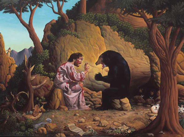
At least as important for me as this shared mythos, which even on a subconscious level suggests non-chaotic planning, is that I can see in Jim Woodrings creation of Weathercraft, and in the tales of Rupert Bear, tremendous craft. I see marvelous draughtsmanship, commanding line, expert storytelling, a link with the history of illustration and folk art, and a hint of the menace that underlies every fairy tale. With the Rupert stories, I never really read the words, or sometimes I did and then I looked at the drawings and I made up my own stories, and my own stories were huge, much bigger than the tiny stories in the paper, or even the books and much darker in spirit. And with Woodring's wordless stories I do the same mind-wandering trick, but with less effort on my part, as the author has kindly added the depth and the darkness for me.

The real joy of this for me is that we have two very different creations' here, on the one hand we have Rupert, a commercial product, designed to please as many of one newspaper's readers as possible, and to offend none. It is hard to imagine a comic beginning more unpromising created, as if it were a confection, like a bonbon: The Editor of the Daily Express, R.D.Blumenfeld, was instructed by the paper's owner, Lord Beaverbrook, to produce some competition to Teddy Tail, a comic strip appearing in the Daily Mail, and the Daily Mirror's, Pip, Squeak and Wilfred. It just so happened that the News Editor of the paper, Herbert Tourtel, was married to Mary Caldwell, a trained artist and an illustrator of children's books, and he suggested his wife for the task in hand; and that's why Mary sat down and created Rupert the Bear for the Express.


The first Rupert the Bear story, The Adventures of a Little Lost Bear, appeared on 8th November, 1920, illustrated by Mary, with little captions under the drawing provided by her husband. In the beginning, the little fellow was quite erratic, showing up only occasionally, but Mary really hit her stride in the 1920s; during that period it is generally accepted that Rupert's adventures became more imaginative,with Mary introducing more magic to her folk and fairy tale-inspired stories, introducing the mystical "wise old goat" and whenever necessary, a fairy or two, to sprinkle some magic in Rupert, Bill Badger, Algy Pug, and Beppo's path. The character's increased popularity saw Mary's stories appearing in a string of reprinted collections and Rupert's adventures also appeared in the Daily Express Children's Own, a pull-out supplement from the paper. Mary continued to draw Rupert until her eyesight began to fail in 1935.


After Mary retired from the strip in 1935, the Express recruited the renowned Punch and Tatler illustrator, Alfred E Bestall MBE (1892-1986), who also had experience illustrating books for Enid Blyton, to take over the job of writing and illustrating Rupert for an initial period until they found a permanent replacement for the strip's creator. That "initial period" extended until he retired thirty years later in 1965, and saw the introduction of the familiar, regular, two-panel newspaper format of the strip. By the time he hung up his pen, Bestall had written and illustrated almost 300 Rupert stories for the daily paper, and for the now highly-prized Rupert the Bear annuals, which have appeared every year now since Christmas 1936, expanding Rupert's world and introducing new characters like Pong-Ping, Tiger lily and her father, Bingo, and the Merboy.


And on the other, we have the work of the leading surrealist cartoonist working today, Jim Woodring. His self-publishing creation, Jim, an anthology of comics, dream art, and free-form which Fantagraphics picked up in 1986, six years after its creation, spawned Woodring's celebrated, wordless, surrealist series Frank, who also features as a cast member in Weathcraft.


A self-taught cartoonist, Jim Woodring has extensive experience in almost every aspect of the craft, in addition to spells in animation, Woodring created a comics series for children, has worked with Harvey Pekar on the celebrated American Splendor Comics, worked on the Aliens and Star Wars comic books, and along with F. Solano Lopez adapted the movie Freaks for the comic world. His wonderfully inventive much sought after toy designs sold in vending machines in Japan (it just doesn't get any cooler than that), and his paintings are very much in demand.


In December 2006 he became one of the first group of United States Artists Fellows and in 2007, his work featured prominently at the Centre National de la Bande Dessinée et de l’Image in Angoulême, France, as part of the international comics festival. Woodring received an Inkpot award at the 2008 San Diego Comic Convention, and was awarded an Artist Trust/Washington State Arts Commission Fellowship in 2008. He also illustrated the front cover, endpapers, and the song 'Toy Boy' in would-be cartoonist, singer-songwriter, Mika's 'Songs for Sorrow'.

Of course the actual content of the "text", even when the text is wordless, is poles apart. Rupert bear lives with his parents in a cottage in the middle of Nutwood. He invariably sets off on an adventure by undertaking some errand or other for his mother and ends up in some fantastic adventure, along with one or two of his "pals", Bill Badger, Pong-Ping, Algy Pug, or others, and aided the magical inventiveness of the Wise Old Goat (can't help wondering what the far-right in the US would read into that). Woodring's stories on the other hand contain pain, torture and little random acts of violence. The air can be populated with souls (jivas) resembling children's spinning tops and the sky and the earth can be ripped down and knotted together.

These works, Weathercraft and Rupert, should be poles apart, and yet they have much in common; both are brilliant ideas, both are brilliantly drawn, both "exist" in fully imagined worlds, worlds familiar enough to be like the world we know, but different enough from the world we know for magic to happen. It may be a fanciful notion on my part, but I can see much more craft in these two magical comic creations than chaotic meanderings, and I'm relieved. I'm relieved partly because I can suggest that rather than becoming a little bonkers, the beginning cartoonists I teach just have to read widely and work exceptionally hard at creating their own world and then populating it with their creations, and that then, they just might create something as otherwordly and lasting as Rupert bear, or as otherworldly and beautiful and new as Weathercraft.